work
nati miranda graphic design
Date: Oct 14, 2014
Client: Dr. Nati Miranda
Logo design Branding
This was a wonderful project that you can do for Dr. Nati Miranda. After returning from Brazil, she wanted to renew her personal branding, since she wanted to invest in new equipment and graphic lines. The colors we were able to connect very quickly. But the process of creating the logo took time and refinement, to the point of sitting down one afternoon and seeing how we connected

Challenge
The challenge for dentists is that people don’t look for them because they work on their teeth hurts. It seems scary to them. With this in mind, I decided not to use any type of instrument in the elaboration of the logo. I didn’t want to remind people of all those utensils.

Concept
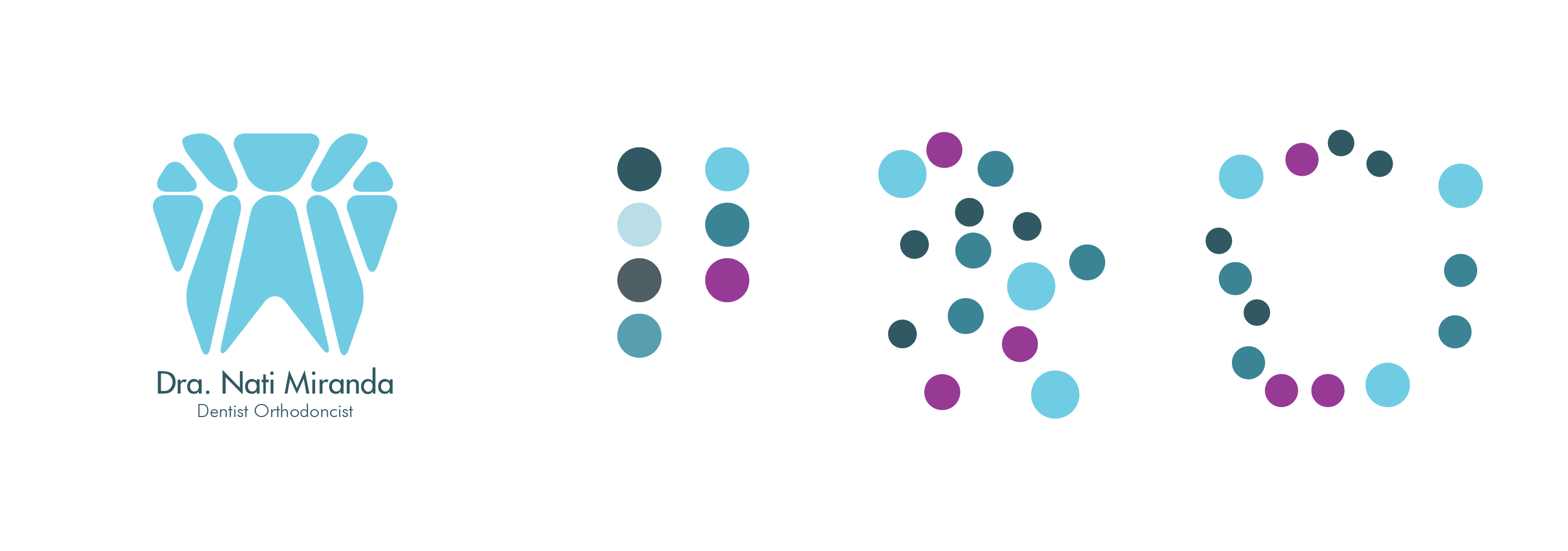
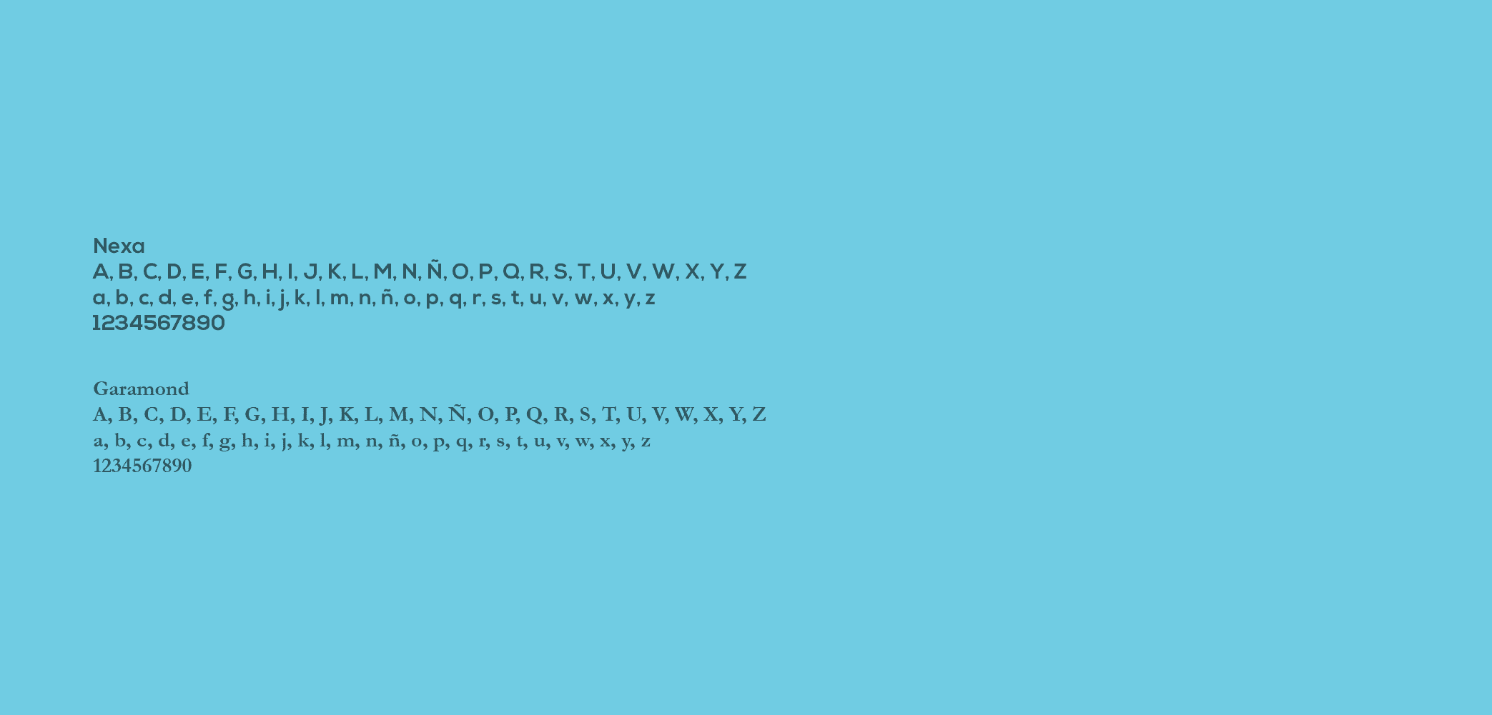
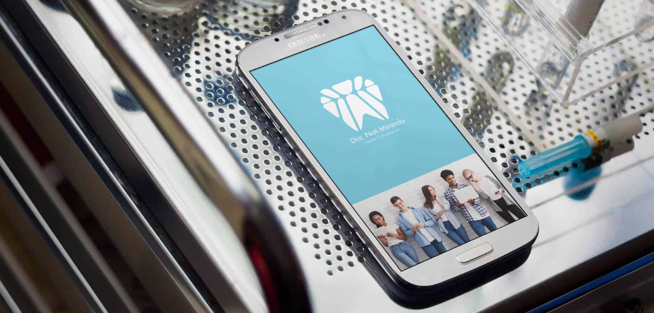
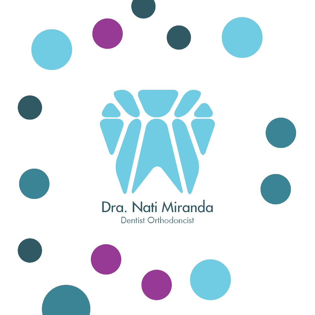
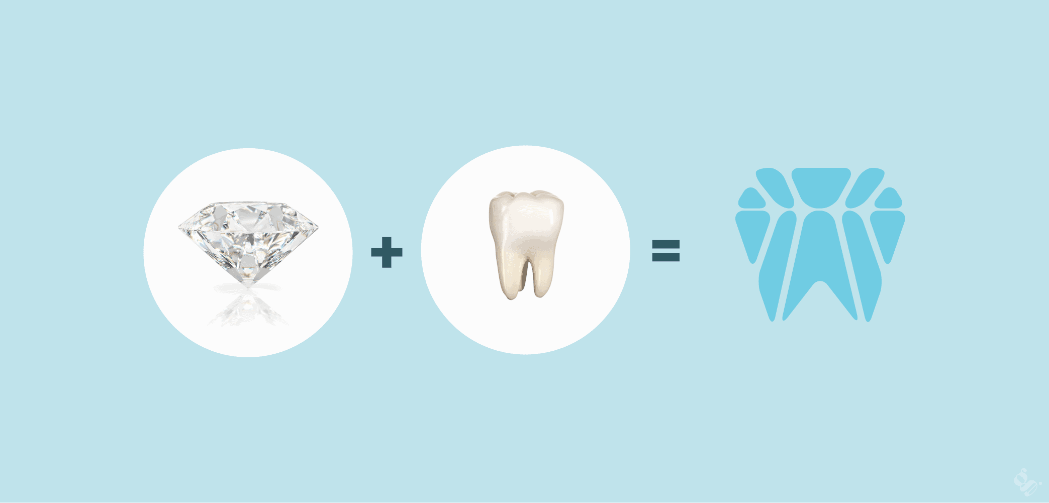
Remind people that going to the dentist is a good thing when making the diamond and tooth connection. Futura typography adds formality and familiarity at the same time. I used a similar color palette, expressing a bit of my client’s femininity and sweetness. I transformed a stigma into a tool to create and bring my client closer to her users.
Approach
As part of what you wanted to achieve, get insights for your graphic line “Pain is brief”. This constant reminder opens doors for patients by opening them up to discussing ways to cope with pain. It is important to Nati that her patients are able to bond and thus have a better experience.
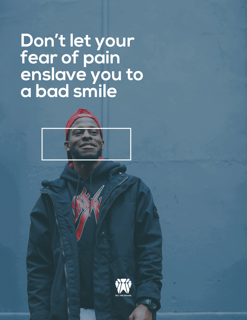
“Don’t let your fear of pain enslave you to a bad smile” was my response to his younger patients, giving a slightly more edgy message.
