portfolio
bnm ventanas graphic design

Date: Apr 4, 2016
Client: BNM ventanas
Logo design Branding
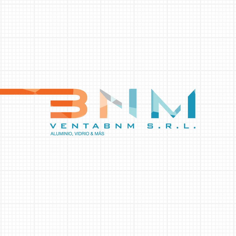
The concept looking for ventabnm S.R.L. It was something sophisticated, minimalist but at the same time elaborated. They wanted to create something that will represent them in the personalized form of that customers and maintain a homogeneous line. Another point was viability, since your audience can be both direct and indirect
Challenge
A boring industry where everything is blanck and white was part of the challegenge. Creating something that the audience will feel identified but algo change the scene and pop up from the competition.
Concept
During the creative process, it was seen that flammable colors like orange would help give him a touch fresh and edge while blue and gray more seriousness and serenity, making a balance. Also The use of polygons as a part of the logo helped meet the desire of it being elaborated. In stationery essentialism was used a lot, looking for a more universal and functional design.

Approach
A graphic line delivered but that give a lot of security. From the typography to the small details of color and space made this graphic line something to remember. Inspiring, professional and friendly it was the perfect combination for this brand


